
We’re a full decade late to Veep. And by “we,” I mean the two of us: partners, parents, creatures of habit who now consider one hour of dark comedy and dark chocolate almonds a form of couples therapy. It’s become our ritual. Kids asleep (or pretending to be), laptops closed, phones on ‘Do Not Disturb’, couch worn out and indented just right, and dogs curled up by our feet, on our bodies, or wherever they deem appropriate on any given night. “OK. I’m ready. Press play!”
The show, as everyone who got there in a timely manner already knows, is brilliant. Razor-sharp. Ruthless. And every line lands. Every character is irredeemable in their own distinct, fucked-up glittering way. And somehow, every moment feels like déjà vu. Like we’ve read about it (or some version of it) in a headline or watched it unfold in a press conference. Just without the Emmy-winning comedic timing and wit.
It’s easy to miss because it’s working so well. You’re not thinking about structure. You’re just laughing. Or cringing. Or pausing to Google if a former VP can legally threaten to fire the entire Joint Chiefs during a brunch rant. Something I feel like many of us have been doing a lot lately. 🤚
But what keeps circling my brain isn’t just the politics or the farce. It’s how tight it all is. The experience of watching Veep is weirdly seamless. You don’t need to keep track of complex plot points. You don’t get lost in a fog of names or acronyms. You feel the dysfunction, sure, but never the friction. It’s chaos, but it’s also clear.
And that’s when it hit me. Veep is a masterclass in UX design.
The characters, their motives, their decisions, their emotional booby traps, are brilliantly designed. That’s the user experience. The invisible infrastructure. The why behind every what.
Then there’s the acting. The expression, the delivery, the impeccable comedic beats. That’s the UI. The visible layer. The thing you engage with directly. What makes you stay.
It works because both are dialed in. And it made me wonder how often we build real systems where the design is just halfway there. Great visuals but no function. Smart logic but no human layer.
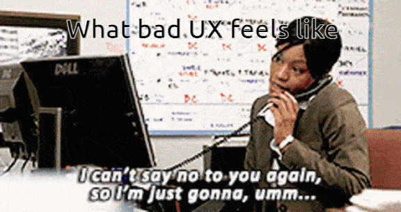
Then you zoom out. From HBO to healthcare portals. From comedy to the DMV. And you realize most public-facing systems aren’t just dysfunctional. They’re unreadable. Unnavigable. Designed like someone actively wanted you to quit halfway through. And I can attest that my ADHD brain, will absolutely quit halfway through!
We joke that America’s politics are broken. Well, maybe not joke as much as state. But my point is, if politics are broken, we can be sure that means America’s UX is wrecked.
We watch Veep and laugh at the absurdity. Then we get a letter from a government agency with seven fonts and a QR code that leads to a 404 page. Suddenly, it doesn’t feel that absurd. It feels like a documentary with better writing.
Maybe that’s why we keep watching. Because Veep doesn’t just entertain. It soothes. It gives shape to the feeling that everything’s kind of screwed, but at least it could be funny. At least, in this version of reality, the chaos is intentional. Designed.
There’s something strangely comforting about that. Something oddly aspirational.
I don’t have a solution here. No slick CTA. No “download our guide to frictionless user interfaces” moment. Just a small observation from the foot of a well-worn couch. Good design makes dysfunction bearable. It can even make it beautiful. And if we can’t always fix the UX of the systems we live in, maybe we can at least build better ones in the corners of the internet we control.
Until then, we’ll keep watching Selina flame out in slow motion. Laughing, cringing, passing the almonds. And dreaming, just a little, of a world where even our bureaucracies come with flawless comedic timing.
And if you’re thinking, “how have you never watched Veep until now?” Probably because I had babies I was attempting to breastfeed. Don’t judge, and please don’t tell me how it ends.
Until next time... ✌️